


Few design choices transform a room as immediately — or as meaningfully — as a well-composed gallery wall. Once considered a niche statement reserved for the design-obsessed, curated wall arrangements have quietly become a cornerstone of modern interiors. The reason isn’t trend-chasing; it’s something more fundamental. A thoughtfully assembled display does what no single piece of furniture or paint color can: it turns a house into a story. Whether you’re a renter navigating lease restrictions, a homeowner ready to make a lasting commitment, or someone who’s never hung more than a single frame, the process is far more approachable than it looks.
Understanding What Makes a Gallery Wall Work
At its core, a gallery wall is a curated collection of framed art, photographs, and mixed media arranged cohesively across a single wall surface. What separates a striking arrangement from a chaotic one comes down to intentionality. Rather than simply filling empty space, a well-executed display functions as a true focal point — one that anchors the room, establishes its mood, and communicates something genuine about the people living there.
There’s also a psychological dimension worth considering. Personalized displays make spaces feel authentically inhabited. A wall layered with meaningful images and objects generates a sense of warmth and belonging that no single statement piece, however bold, can replicate on its own.
Planning Before You Hang a Single Nail
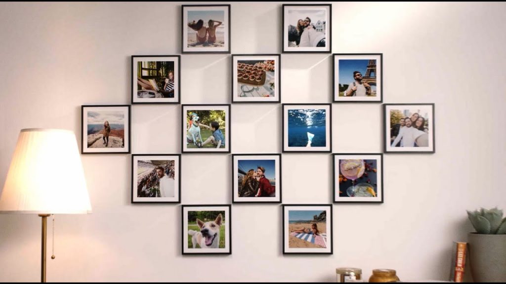
The most common misstep in creating a wall display is bypassing the planning phase entirely. Before you select a single frame, define your design intention. What should this wall communicate — a family narrative, a collection of travel memories, an affinity for a particular artistic style? That underlying theme becomes the organizing principle that transforms a random assortment of pieces into something coherent and deliberate.
Layout matters just as much as content. Symmetrical grid arrangements deliver clean, predictable results, but asymmetrical layouts have gained considerable favor for the effortless, collected quality they project. A hybrid approach — combining hung pieces with frames leaned against a shelf or ledge — adds visual interest while reducing wall commitment, a practical consideration for renters who need to keep damage to a minimum.
For color and materials, consider how earthy, warm palettes — burnt oranges, muted greens, smoky neutrals — can add depth and a sense of comfort. Frame materials, whether wood, metal, or sustainable alternatives, should feel consistent enough to unify the display without being so uniform that the whole thing reads as a matched set.
Curating the Right Mix of Art and Photography
Visual interest thrives on variety in media: canvas prints, framed photographs, illustrated prints, and found objects each bring distinct textures and scales to the arrangement. Mixing shapes and sizes introduces personality without demanding perfect symmetry.
Scale is one of the most underestimated variables in this process. A single oversized piece — 40 inches or larger — can serve as an anchor around which smaller works orbit, lending the composition confidence while actually reducing visual clutter. The key is balancing those larger pieces with smaller companions to maintain rhythm without crowding the wall.
Personal narrative is ultimately what elevates a gallery arrangement above mere decoration. Custom family portraits, travel photographs, and illustrations tied to specific memories transform walls into living memoirs — displays that grow and shift alongside the people who inhabit the space.
Installation, Spacing, and Long-Term Evolution
Modern peel-and-stick hanging systems have made the installation process genuinely renter-friendly, eliminating the anxiety around permanent wall damage. These modular tools allow for easy rearrangement as tastes evolve and life circumstances change — arguably their greatest advantage over traditional hardware.
When hanging, keep spacing between frames consistent — typically two to three inches — to create visual harmony even within an asymmetrical layout. Before committing anything to the wall, do a dry run on the floor. Paper cutouts or strips of painter’s tape let you test positioning and spacing without consequence, saving considerable frustration later.
Finally, resist the urge to treat your display as a finished installation. The most compelling gallery walls are ongoing projects — rotated seasonally, updated with new acquisitions, and occasionally edited when certain pieces no longer feel relevant. A wall that evolves alongside its creator stays perpetually interesting, becoming a genuine reflection of identity, memory, and growth rather than a snapshot of a single afternoon’s decisions.
Start simply: identify the pieces that matter most, and let those anchor everything else.


Add Your Comment