


Personal taste shapes how a home feels from the moment you walk in. Art is often the first cue, setting a tone that words rarely capture. When every piece reflects the people who live there, rooms start to feel connected and easy to love.
Families are not monoliths, though. You balance different ages, interests, and comfort levels. Good choices respect those differences, while still building a calm, cohesive backdrop for daily life.
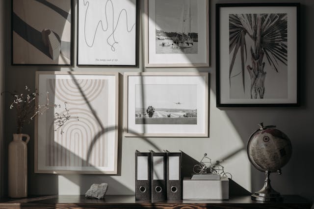
Taste Anchors Belonging
Art that echoes your routines can make a hallway or kitchen feel like home. A framed map from a favorite holiday or a print of local flora becomes a shared reference point. Guests read these stories as soon as they step inside.
Start in the rooms everyone uses. The living room often carries the family’s voice, while the primary suite can hold quieter notes. Try small trials before big buys, like taping printouts to walls to test scale and sightlines.
Let one detail tie things together. A repeating motif, like soft curves or botanical lines, connects spaces without matching. This is the sweet spot where design meets memory.
Finding Flow In The Bedroom
Rest needs gentle cues. Cool tones, softened contrast, and organic shapes help the nervous system downshift. Edges that feel hand-drawn can be restful.
Begin with your headboard wall. The right scale frames the bed and controls the room’s focal energy. You can browse for ideas and get bedroom wall print inspiration, then return to your shortlist with fresh eyes. A simple mockup on your phone helps you visualize spacing.
Pair pieces that share a feeling, not a theme. A misty landscape and a quiet abstract might speak the same language if their lines and values agree. Keep glare low with matte finishes.
Mood, Memory, And Meaning
Art can cue moods you want to feel every day. Soft abstracts calm a busy hallway, while a bold graphic can energize a slow morning. Memory works here too, turning a simple photograph into a daily ritual.
Keep meaning front and center. The piece your child made at age 6 can sit near a gallery print if frames and spacing are thoughtful. Mixed value does not mean visual clutter when the scale is planned.
You can even write a mini story for each room. In 2 lines, define the feeling you want, then select pieces that fit that script. It keeps choices clear when energy runs low.
Trends Are Clues, Not Rules
Trends can spark ideas, but they should serve your taste. An Associated Press piece noted a dramatic rise in searches for French cottage decor, which shows how many people crave comfort and nostalgia right now. Use that as inspiration, not a checklist, and filter it through your family’s style.
Try trend sampling. Pull one element at a time, like a vintage botanical or tiny gingham detail, and test it with your existing art. If it sings, keep it. If not, let it go.
Trends evolve fast. Your walls should not feel like fast fashion. Choose prints that still feel like you in 2 years, and let smaller accents do the seasonal lifting.
Color Confidence For Shared Spaces
Color carries emotion. Homes & Gardens spotlighted butter yellow as a standout 2025 shade, which signals a move toward warmth and optimism. If that fits your family’s mood, weave it through two or three rooms for a soft rhythm.
Use color like a volume knob. Bedrooms can sit at a lower setting with muted tones, while entries can go louder to signal energy. Keep one neutral running through frames or mats to steady the mix.
Test with paper first. Print color swatches of your shortlisted art and tape them at eye level. Check in the morning and evening light. If a hue nags you at night, it will not grow quieter.
Designing For Joy Without Visual Noise
Joyful rooms do not have to be loud. Marie Claire reported a sharp rise in interest around dopamine decor, which is all about feel-good color and playful pattern. You can translate that into art with just a few well-placed hits.
Try layered restraint. One energetic print over the mantel, then calmer pieces around it to let the eye rest. Joy shows up as balance, not competition.
When in doubt, set simple guardrails:
- 1 bold piece per wall.
- Consistent frame thickness across a room.
- At least 2 hand widths between frames for breathing room.
Personal taste is the most reliable compass for family home art. It honors memory, mood, and the rhythms of everyday life. When choices reflect who you are, rooms start to welcome you back.
Keep the process simple and kind. Test, rotate, and talk through options. Your collection will look like a life lived together, not a trend board.


Add Your Comment